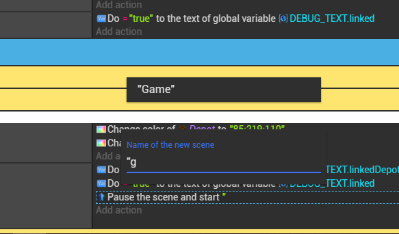
Input can be under panels, and sometime the list can be broken.
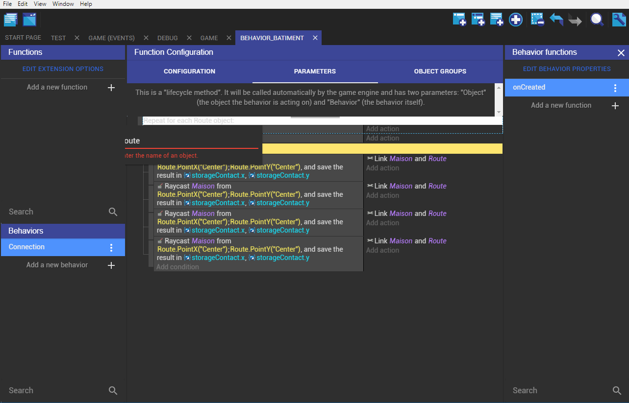
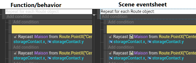
Here text from special event are more white than before in functions/behaviors.
Reported
Input can be under panels, and sometime the list can be broken.
Here text from special event are more white than before in functions/behaviors.
Reported
Fixed the color of the text (and by the way, finally removed that white background in the dark theme - made no sense to have this!) and the popover going behind the panels.
For the auto complete lists, they can indeed be out of place if you scroll - I should probably disable the scroll when opened. It’s a bit less urgent though.